Menu
AGR Theme Development
A theme controls how AGR (the Aussom Graphical REPL) looks, and - if you want - adds behavior through scripts. This guide shows you how to create a theme, where AGR looks for it, how to edit its style and see the change immediately, the full set of style classes you can target, and how to write theme scripts.
This is the starting reference for theme development and will grow over time. For
a quick, always-current catalog, the built-in dark theme's stylesheet is the
living example: duplicate it and read along.
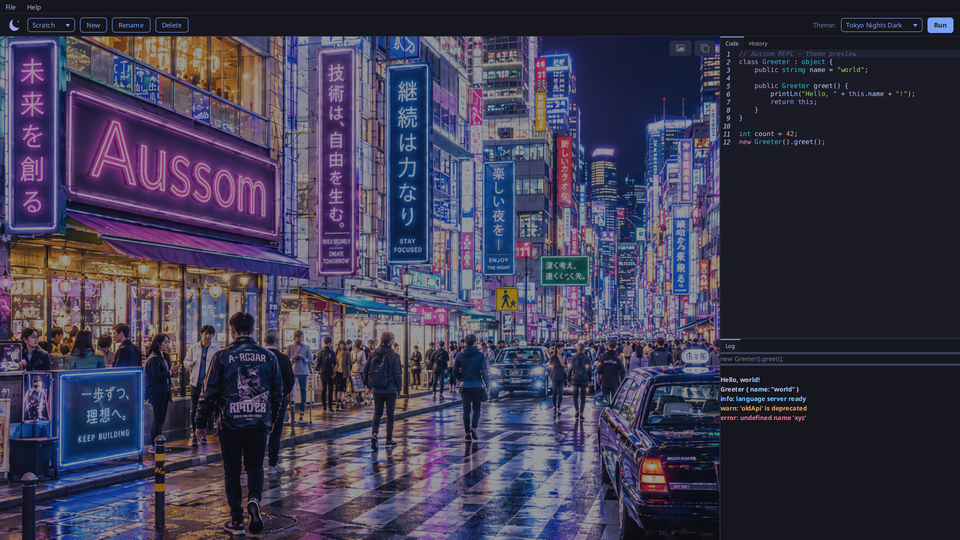
AGR ships with twenty built-in themes, from clean light and dark palettes to neon, retro, and playful looks like the Tokyo Nights Dark theme shown above. See them all in the AGR Theme Gallery, then read on to build your own.
What a theme is
A theme is a directory (a "package") that holds:
theme.yaml- a manifest that names the theme and its stylesheet.- one CSS stylesheet - the styling itself.
- an
images/folder (optional) - any pictures the CSS uses. - a
scripts/folder (optional) - Aussom scripts that run when the theme loads or unloads.
Shared as a single file, that directory is zipped and given the .athm
extension. Inside AGR you import and export .athm files from the Style Editor
(Help > Style Editor).
Creating a new theme
You have two easy ways to start.
Duplicate a built-in (recommended)
- Open Help > Style Editor.
- Select dark or light and click Duplicate.
- Give it a name. AGR copies the whole package - manifest, stylesheet, and the backdrop image - into your themes folder as an editable copy.
- Select your copy and click Open in Editor to edit its stylesheet.
This is the best way to start because you begin from a complete, working theme.
Create the folder by hand
Create a directory under your AGR themes folder and add a manifest and a stylesheet:
~/.agr/themes/mytheme/
|-- theme.yaml
|-- theme.css
|-- images/
    `-- background.png
Where AGR looks for themes
AGR loads user themes from:
~/.agr/themes/<name>/
Each theme is its own directory there, named by the theme. AGR lists every
directory in that folder that contains a theme.yaml, alongside the two
built-in themes. The directory name is the theme's identity - it is what the
theme switcher and your config record.
The two built-in themes (dark, light) ship inside AGR and are read-only. You
cannot edit them in place; duplicate one to make an editable copy.
Editing style with live reload
While AGR is running, edit your theme's .css file and save it. AGR watches
your user theme files and reloads the stylesheet the moment you save, so you see
the change right away - no restart, no re-apply. Keep AGR open beside your editor
and iterate.
Two things to know:
- Live reload works for your themes in
~/.agr/themes/. The built-in themes are inside the app jar and are not watched, which is another reason to duplicate before editing. - Live reload covers the stylesheet. Changes to the manifest or to scripts take effect when you re-apply the theme (switch away and back).
The manifest (theme.yaml)
The manifest describes the package. Only two fields are required.
name: Midnight              # required - the theme's display name
stylesheet: theme.css       # required - the stylesheet file in the package
agrVersion: 1.2.3           # the AGR version you wrote the theme for (informational)
version: 1.0.0              # your theme's own version (optional)
author: Your Name
license: MIT
description: A dark theme with a starfield backdrop.

# Optional - only for themes that run scripts (see "Theme scripts" below):
scripts:
  onLoad: scripts/on-load.aus
  onUnload: scripts/on-unload.aus
- name and stylesheet are required. Everything else is optional metadata.
- stylesheet lets the CSS file be named anything; AGR reads this to find it.
- agrVersion is a note to readers about which AGR version you targeted. AGR does not enforce it.
- scripts is present only when your theme runs code. Its presence is what makes AGR warn a user on import (see the scripts section).
Assets and relative paths
Keep images in the package (an images/ folder is the convention) and reference
them from the CSS with a relative path:
.agr-graphics-stack {
    -fx-background-image: url("images/background.png");
}
Because the stylesheet and its assets live in the same package directory, the relative URL resolves correctly. Do not use absolute paths - they break when the theme is shared.
Size icons to their display size
For a small icon like the brand logo on .agr-title, supply the image already
scaled to the size it is shown at rather than letting JavaFX shrink a large one.
JavaFX's on-the-fly downscaling is not sharp, so a big source image looks
pixelated in a small slot. The logo mark is displayed at 32x32, so export a
32x32 PNG:
.agr-title {
    -fx-pref-width: 32px;
    -fx-pref-height: 32px;
    -fx-background-image: url("images/logo.png");   /* logo.png is 32x32 */
    -fx-background-size: contain;
    -fx-background-repeat: no-repeat;
    -fx-background-position: center;
}
Large backdrops that fill a whole pane (the graphics-area image) are the exception - they are meant to be big. This applies to small, fixed-size icons.
Documentation landing banner
The Documentation window (Help > Documentation) shows a wide banner image across the top of its landing page. This is the second place a theme can supply an image, alongside the graphics-area backdrop.
To give your theme its own banner, put a PNG at this exact path in your package:
images/doc-banner.png
AGR uses it automatically when your theme is active, and swaps it live when the user switches themes. If your theme does not include this file, AGR falls back to its built-in default banner, so the file is optional.
The banner is drawn full width and about 340 pixels tall, cropped to fill (its center shows, top and bottom are trimmed). Use a wide image - around 1920 pixels wide works well - and keep the important content near the center so it is not cut off. The page fades the banner into the theme background at the bottom, so the edges do not need special treatment.
Sharing: import and export
- Export (Style Editor > Export...) zips your theme's directory into a single
.athmfile you can share. - Import (Style Editor > Import...) unpacks an
.athminto your themes folder. If the theme contains scripts, AGR warns you first (see below).
CSS reference
AGR is a JavaFX application, so themes are written in JavaFX CSS. That is close to
web CSS but uses -fx- prefixed properties and JavaFX selectors. If you are new
to it, the JavaFX CSS Reference Guide is the authoritative source for properties;
this section lists the selectors AGR provides so you know what to target.
Every surface is keyed off a specific agr-* style class, so you can restyle one
surface without disturbing the others. The best reference is the built-in dark
stylesheet - duplicate it and read the section comments.
Root variables (recolor everything at once)
Most controls derive their colors from a handful of root variables. Change these
in the .root block and the whole app recolors together. Start here.
| Variable | Role | Dark default |
|---|---|---|
-fx-base |
Base color most controls build on | #1b1e27 |
-fx-background |
Window and pane background | #1b1e27 |
-fx-control-inner-background |
Inside of text areas, lists, fields | #20242f |
-fx-accent |
Accent (selection, focus highlight) | #1aabab |
-fx-focus-color |
Focus ring color | #1aabab |
-fx-faint-focus-color |
Faint focus glow | #1aabab22 |
-fx-text-fill |
Default text color | #d7dae3 |
-fx-font-family |
Chrome font | "Inter", "Segoe UI", sans-serif |
-fx-font-size |
Base font size | 13px |
Window frame
AGR windows are undecorated - the app draws its own frame - so the title bar and buttons are themable.
| Class | Targets |
|---|---|
.agr-window |
The whole window frame |
.agr-titlebar |
The custom title bar |
.agr-titlebar:inactive |
The title bar when the window is not focused |
.agr-titlebar .fx-titlebar-title |
The title text |
.agr-titlebar .fx-titlebar-button |
Minimize / maximize buttons |
.agr-titlebar .fx-titlebar-close |
The close button (style its hover separately) |
.agr-titlebar .fx-titlebar-icon |
The glyph inside a title-bar button |
.agr-menu-bar |
The menu bar (File, Help) |
.agr-menu-bar .menu-button |
Each top-level menu |
.agr-top-bar |
The slim bar under the menu (workspace label, Run) |
.agr-workspace |
The folder name shown in the top bar |
.agr-title |
The brand logo mark in the top bar. A CSS-painted Region - set -fx-background-image to your logo (see "Size icons to their display size") |
.agr-field-label |
Small field labels (e.g. "Theme:") |
Graphics area (the panel on the left)
The graphics area is a stack of layers, painted back to front. Each has its own class; here is what to target.
| Class | Targets |
|---|---|
.agr-graphics-stack |
The whole stack - set the backdrop image and base color here |
.agr-fxgl-host |
The FXGL layer's backdrop - a good place for a vignette or gradient over the image |
.agr-draw-pane |
The user draw surface (shown from the layer selector); solid when visible |
.agr-theme-decoration |
The theme decoration layer (see scripts). Leave it with no background so it stays click-through |
.agr-notebook-layer |
Reserved for a future notebook view |
.agr-graphics-controls |
The control overlay container. Leave it with no background |
.agr-graphics-button |
The layer-selector and action buttons |
.agr-graphics-icon |
The glyph inside those buttons |
A useful pattern for the backdrop: put a centered image on .agr-graphics-stack,
then paint a soft edge fade over it on .agr-fxgl-host. The FXGL surface renders
transparent, so both show through beneath anything the REPL draws.
Important: an overlay layer must have no background to stay click-through. A
JavaFX region with any -fx-background-color - even transparent - captures
mouse clicks across its whole area. Give the control, notebook, and decoration
layers no background at all; only the draw pane (which is meant to block the layer
below it when shown) gets a solid color.
Editor and panes
| Class | Targets |
|---|---|
.split-pane |
The split panes; .split-pane-divider is the drag handle |
.agr-tabs |
The compact tab panes (Code / History, Log) |
.code-area |
The code editor |
.code-area .caret |
The text cursor |
.code-area .selection |
Selected text highlight |
.code-area .lineno |
Line numbers |
.code-area .paragraph-box:has-caret |
The current line |
.output-area |
The output transcript (Log tab) |
.history-list |
The command history list |
.completion-popup |
The autocomplete popup |
Code editor syntax colors
The editor colors code by token. Target these to set your syntax palette.
| Class | Token |
|---|---|
.code-area .text.tok-keyword |
Keywords |
.code-area .text.tok-string |
Strings |
.code-area .text.tok-number |
Numbers |
.code-area .text.tok-comment |
Comments |
.code-area .text.tok-type |
Types |
.code-area .text.lsp-error |
Error underline from the language server |
Output transcript colors
Each kind of output line has its own class, so you can color them independently.
| Class | Line kind |
|---|---|
.output-area .text.out-echo |
The echoed source of a submission |
.output-area .text.out-value |
A returned value |
.output-area .text.out-error |
An evaluation error block |
.output-area .text.out-err |
An engine error line |
.output-area .text.out-info |
An info message |
.output-area .text.out-warn |
A warning message |
.output-area .text.out-log |
An engine log line |
.output-area .text.out-print |
Raw print output |
Controls, menus, and dialogs
| Class | Targets |
|---|---|
.button |
All push buttons; .button.agr-run is the accented primary button |
.combo-box |
The theme dropdown |
.context-menu / .menu-item |
Drop-down menus and their items |
.about-dialog |
The About dialog |
.keybindings-dialog |
The Key Bindings dialog (rows, sections, table) |
.style-editor-dialog |
The Style Editor dialog (list, sections, metadata) |
Help viewer (documentation browser) chrome
The doc browser's toolbar and search are JavaFX controls you can theme. The doc pages themselves are HTML and are recolored automatically from your theme's main colors, so you usually do not style them here.
| Class | Targets |
|---|---|
.agr-doc-toolbar |
The browser toolbar |
.agr-doc-button / .agr-doc-icon |
Toolbar buttons and their glyphs |
.agr-doc-search |
The search box |
.agr-doc-results |
The search results list |
.agr-doc-find-bar / .agr-doc-find-field |
The find-in-page bar |
.agr-doc-zoom |
The temporary zoom-percentage pill |
Theme scripts
A theme can run Aussom code to add behavior - animate the graphics area, draw extra chrome, or expose commands you can call from the code window. Scripts are optional; a theme that only styles needs none.
Enabling scripts
Add a scripts block to the manifest and put the scripts in the package:
scripts:
  onLoad: scripts/on-load.aus
  onUnload: scripts/on-unload.aus
onLoadruns when the theme becomes active.onUnloadruns when the theme is switched away or the app closes. It is optional; AGR clears a theme's decorations and hooks on switch regardless.
Where scripts run
A theme's scripts run in their own engine, separate from the code window's
workspace. Your theme code never shares variables with the user's REPL - it reaches
AGR through the theme object instead. The engine has the full standard library,
and fx, fxgl, and theme are included for you.
The theme object
Your onLoad script reaches AGR through the theme object. It can decorate two
surfaces and register commands.
Decoration layer (durable). theme.decoration() returns a plain fx.Pane
that survives an engine reset. Good for static chrome.
include theme;
include fx.Label;

theme.decoration().add([new Label("Hello from the theme")]);
FXGL layer (expressive). For entities, particles, animation, and the game
loop, decorate the FXGL layer. Because FXGL restarts on an engine reset,
register a callback with theme.onGraphicsReady(...); AGR runs it each time the
FXGL game is ready, so your decorations are re-applied and survive switches.
include theme;
include fxgl;
include fxgl.GameScene;
include fx.Circle;

theme.onGraphicsReady(::decorate() {
    fxgl.getGameScene().addUINode(new Circle(50.0));
});
Commands the code window can call. Register a named hook, then call it from
the code window with agr.theme(name, ...).
theme.register("pulse", ::pulse(size) {
    c.info("pulse " + size);
});
From the code window:
agr.theme("pulse", 10);
The hook runs in the theme's engine. If no theme is active or the name is not
registered (for example after switching themes), agr.theme(...) returns null.
The theme's directory. theme.dir() returns your theme's folder path, so a
script that fetches a fresh asset (say, a new background image over the network)
can write it into the package. It returns null for a built-in theme.
Lifecycle summary
| Hook | When it runs |
|---|---|
onLoad |
Once, when the theme is applied |
onGraphicsReady callback |
Each time the FXGL game is ready - at startup and after an engine reset |
| Registered hooks | On demand, when the code window calls agr.theme(name, ...) |
onUnload |
When the theme is switched away or the app closes |
Errors in a theme script are reported to the output transcript. A broken theme does not crash AGR or block switching to another theme.
Trust and consent
Theme scripts run with the same privileges as your own code - they can read and write files, use the network, and run programs. This is deliberate: it is what lets a theme do useful things like refresh a background from the web. It also means a theme is code you are choosing to run.
Because of that:
- A theme with no scripts imports silently.
- A theme with scripts shows a warning on import ("this theme runs code") and imports only after you agree.
Only import scripted themes from sources you trust, the same way you would treat any program you run.